SWIPE
Front End Web Development
PERSONAL PORTFOLIO • Project
Tools ~ Figma, HTML, CSS, JS, Github
Curating and building design + engineering skills by creating a functional personal website, mastering HTML, CSS, and JS

Problem statement
In modern businesses, having one concentrated digital home base is extremely crucial as it connects distanced users to a singular brand and message.

Branding and storytelling is what attracts people to our channels, so applying this concept, I created a personal website to showcase my own brand.

During my own free time, I mastered the basics of web development with HTML, CSS, & JS, gaining the flexibility to bring creative ideas to life and the technical insight needed to navigate websites effectively.
Problem statement
Problem statement
Research
Home Page
Introduction Screen
When creating this personal website, I needed to create an index page where users could have access to all of my projects and gain more interest in my background. I aimed to go for a bright pastel color & sleek aesthetic, representing my personality and brand. As I created this page, I had many iterations to get to where it is today, and I am constantly improving it!
Projects & Experiences
From the initial navbar, I changed a couple of features that would be crucial to not only the overall look but the initial look of website as well. Not only was this inital part of the home page changed but the projects & experience section drastically changed as well.
Version 1
Horizontal Layout
Text Summary
No Animations
Version 2
Vertical Cards
Text Summary
No Animations
Version 3
Vertical Cards
Simple, Minimal Summary
Parallax Scrolling
Navbar Tabs
Version 1
Version 2
Version 3
For the navbar iterations, I thought the initial pink background took away from the background image, so I firstly refined it to simplify the overall look. However, on the scroll, the navbar text would overlap with the text in the other sections, so I added a fade-in animation through JS that added the pink background throughout the page.

In addition, I realized that the "Projects" section was disorganized and didn't fully showcase my different strengths & skills. Therefore, I split up the sections into two different parts - Projects & Experiences. As I progressed throughout my own work and academic experiences, I realized that this section could be further specified into the types of experience and projects I was doing ranging from Game Design to Product Marketing.
Research
About Me
For my "About Me" page, I wanted to create a space that not only tells my story but also reflects my design style. As someone with a background in Business Administration and Human-Computer Interaction, I have always believed that design should be user-centered and personal. I wanted this page to feel like a reflection of who I am—both professionally and creatively.
I made sure the design was user-friendly, with easy navigation to my resume and links to connect with me. I wanted the overall design to feel cohesive, where every element from the colors to the typography work together to create a balanced experience blending personal storytelling with my achievements!
Research
Media
In order to truly showcase my design eye and passion for art, I decided to add this section in my portfolio. I wanted to show users my creative side, and all the passionate projects I've worked on over the years!

Initially when I worked on this page, I came up with the idea of a carousel to showcase my work in an interactive way (pictured below). It was an engaging way to show users my skills in JS while also showcasing the art pieces.

However, after having this design on my website for about a year, I realized that users couldn't cohesively see the pictures all together, and therefore, they couldn't get a more cohesive picture of who I was and how my work represented me. Therefore, I presented the art in a 3x3 grid structure that layed out all the pieces, so users could now collectively view my brand!

Research
Special Features
Secret Fashion Mode
In the "About Me" section, there was a short explanation on my background and my identity, but I felt as if the engagement and interaction could be higher. I wanted to further add an element that better showcased who I was and reflected my personality. Therefore, I added this "Secret Fashion Mode" with JS where users could view different aspects of my character and personality!
Onboarding and Characters
As I created this mode, I added 8 different characters that closely reflected my passion, grit, and creativity. In addition, I added an onboarding section that explained what the secret mode entailed and how to navigate it.
Character Selection
In order to make the mode more interactive and have effects in the UI, I added JS using a modal function that created a pop-up and also allowed users to select characters. When users select their own character, it changes the inital image on the "About Me " page:
Connecting Characters to Experiences
When creating these character, I made them with the intention of connecting them to my experiences. With each different character, it portrays a different part of personality and skkill that I have applied to each and every one of my projects. I thought that this part would be extremely important to add in at the end of the modal as it created more of a purpose for the pop-up.
Animations (Swiping + Hover)
As I first made individual project pages, I created two parts in the introduction of the pages: a project overview and a process section. This ensured that my project's summary was clearly organized, and presented and that users could utilize the process section as a table of contents to automatically view the content they wanted to see.
However, I realized that the information looked too cluttered and could have been designed in a more effective a way. Therefore, I created two different sections for it with swiping, fade-in, and hover animations to make it more engaging to the user.
Swiping Action to Navigate to Sections
Animate Up on Hover (Process Section)
Fade-in Animations for Sections
Research
Reflection
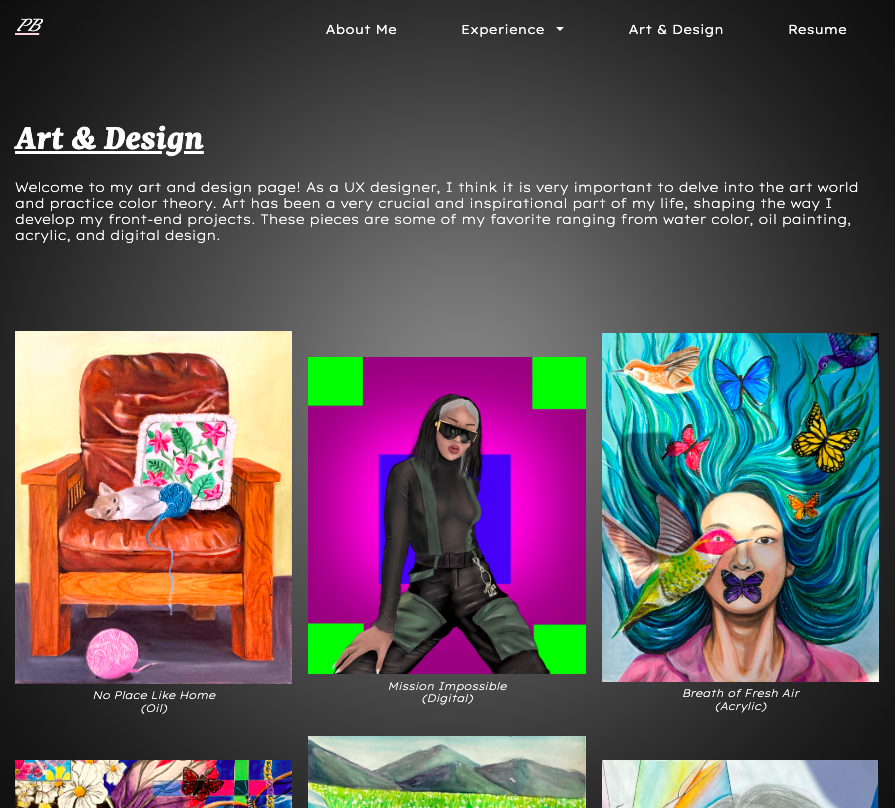
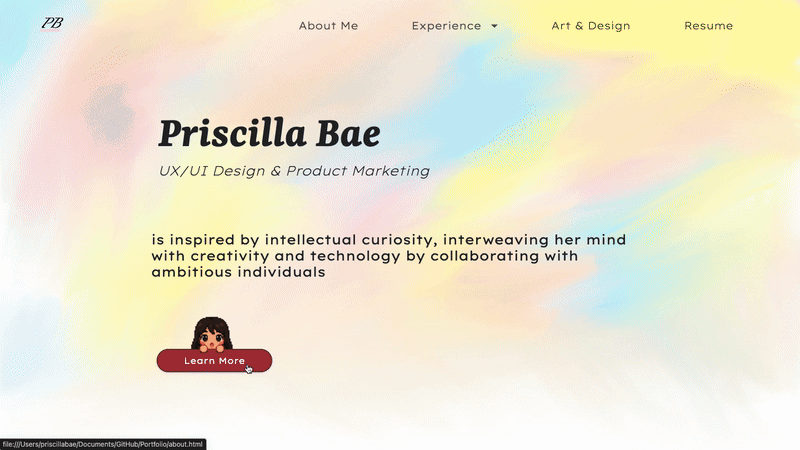
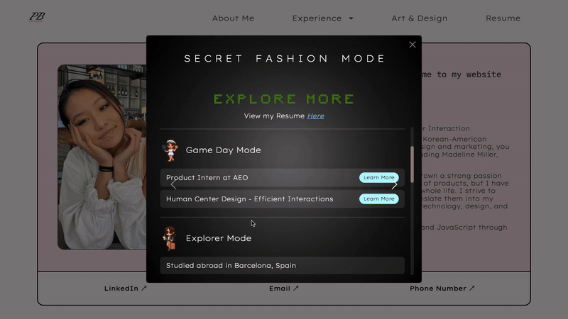
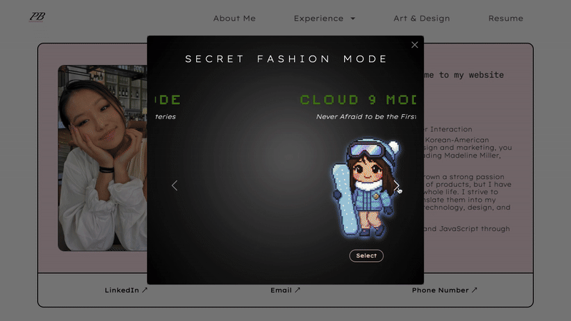
Building my portfolio website was a hard-working and rewarding experience. I really wanted it to show off my work but also give a glimpse of my personality and design style. It was a bit tricky balancing the visuals with functionality, but I focused on making it easy to navigate while still being visually interesting. I spent a lot of time figuring out the right layout, colors, and fonts to make sure it felt like "me."

It was also a great chance to think about how to showcase my projects in a way that tells a story. I didn't just want to post my work—I wanted to explain my design process and what I learned along the way. Playing around with HTML, CSS, and JavaScript was a good way to test out some cool features and make sure the site works well on different devices. All in all, it was a project that helped me grow as a designer and create something I'm proud of.