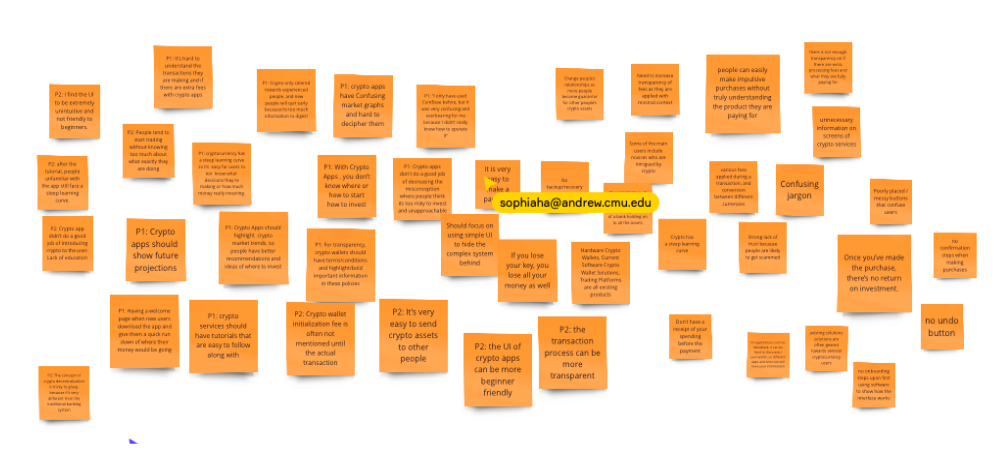
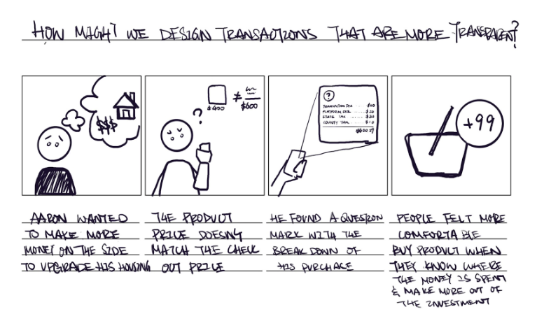
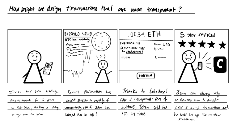
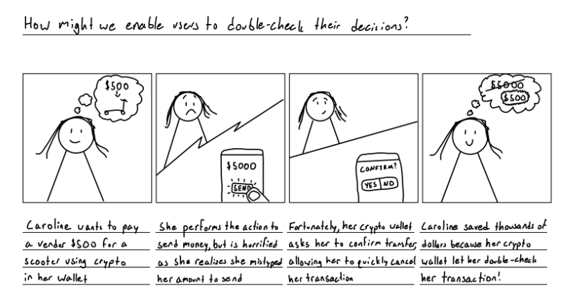
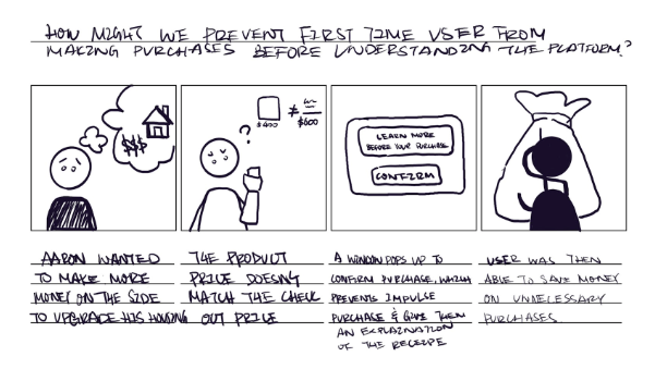
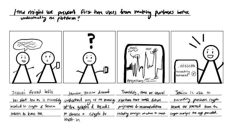
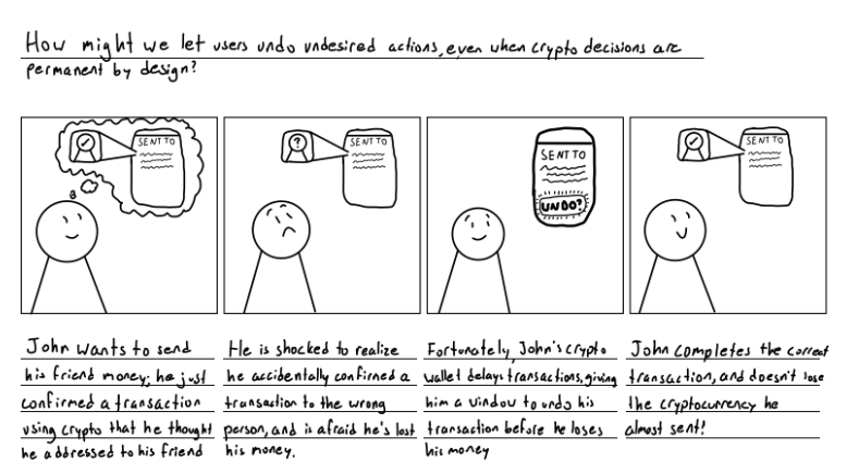
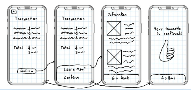
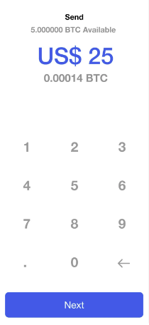
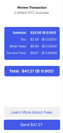
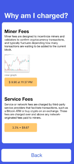
Ethically Designed Transactions
COINBASE • Project
Tools ~ Figma, Canva, Google Suite
AEO logo
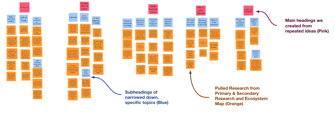
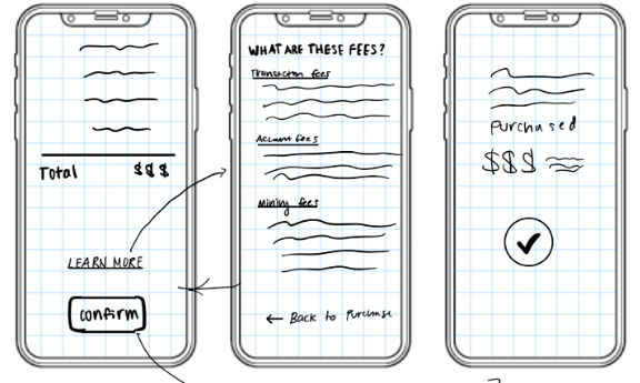
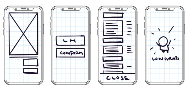
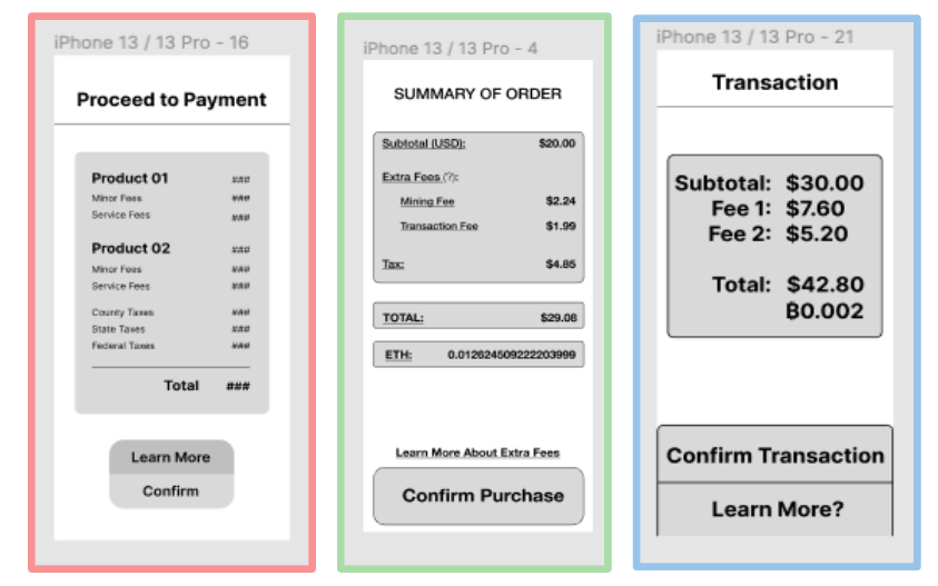
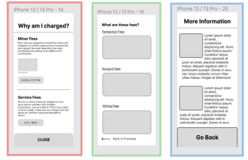
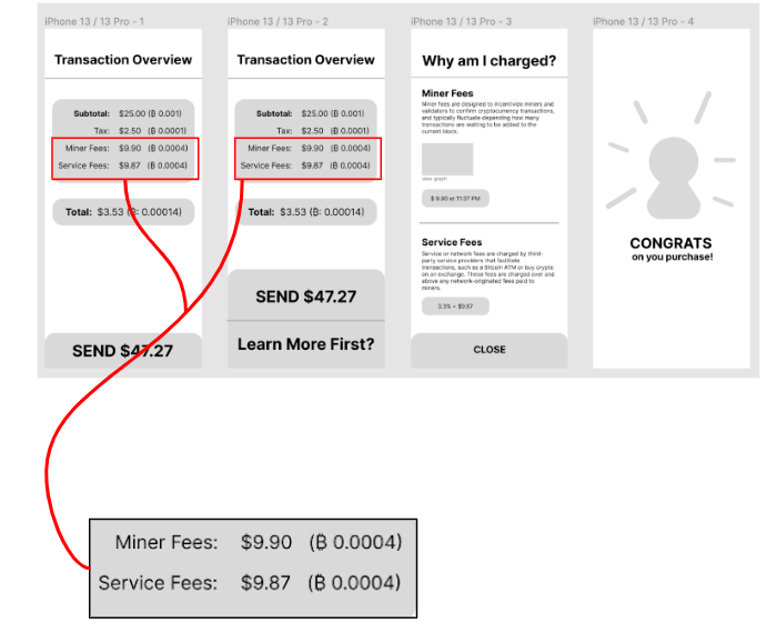
Redesigning Coinbase's mobile features to simplify overly complex systems, increasing transparency through apparent transaction fees

Problem statement
Crypto wallets often confuse beginner users with unclear interfaces and hidden transaction fees. This lack of transparency creates barriers to entry and trust. Our goal was to identify these pain points and redesign the wallet experience to be more intuitive, ethical, and user-friendly.
Problem statement
Problem statement
Research
Secondary Research Amlos Amlos Amlos
Primary Research
Amlos
We started by drafting and finalizing a script with an introduction, asking for verbal consent, and 3 key questions that evaluate the overall experiences and feelings of individuals new to cryptocurrency.

Next, we searched for 3 individuals that fit our criteria of being interested or are novices in crypto and determined 3 college students (19/20 yo), 2 male and 1 female, uninvolved in Crypto.

Lastly, one of our members asked questions while the other took notes and quoted crucial answers that would help us create an additional feature, simplifying the transaction for them.
User Research
How was your experience using cryptocurrency apps?
  • "Confusing market graphs and hard to decipher them"
  • "Introduces a lot of crypto products in the app."
  • "I see cryptocurrency as an investment, and a fairly risky one at that. I would rather invest by more traditional means."
  • "Initialization fee is often not mentioned until the actual transaction"
What are the biggest challenges in using crypto apps?
  • "I find the UI to be extremely unintuitive and not friendly to beginners"
  • "People tend to start trading without knowing too much about what exactly they are doing."
  • "The crypto ecosystem is unique, and so even someone coming from more traditional stock trading might not know everything."
  • "These platforms don't do a good job of decreasing the misconception where people think its too risky to invest and unapproachable."
What do you think could be improved when it comes to using wallets?
  • "Instead of simply showing increases and decreases of the market in the past, maybe show future projections"
  • "Agreement policies and highlight/bold important information in these policies "
  • " Users should be able to input their experience in cryptocurrency, and tutorials can be arranged accordingly to their experience."
  • "Security and risk management should be improved. Unlike a centralized bank, if the person loses their keys, they lose all their assets."
Coinbase Research
Why Did We Choose Coinbase?

We chose to evaluate Coinbase, a popular cryptocurrency exchange platform, and we primarily focused on user transparency in additional fees. Coinbase is one of the most popular platforms for cryptocurrency, so if we were to implement this add-on, it would change the decisions and knowledge of millions of users. We chose Coinbase specifically because…

  • Novices tend to float towards these popular applications such as Coinbase
  • Coinbase tends to have hidden fees with little to no explanation
  • Coinbase has a strong reputation of helping new users learn cryptocurrency without decentralizing their wallet
  • Several people use this platform, but it's UX/UI can be tremendously improved
Existing Design
Amlos
Amlos
Amlos
Branding
Basing our design on an existing platform, we chose one of the biggest crypto wallet applications CoinBase. However, unlike facebook or Instagram, CoinBase doesn't have their icon shown in their interface. Before starting our Hi-Fi prototype, we first created a branding board that contains the color, font, and button CoinBase use for us to reference while prototyping.
Prototype Scenario
We noticed a few thematic trends in our storyboards and user scenarios from our storyboarding and user scenarios. In particular, we noticed:
  • Cryptocurrency wallet users value fee transparency and ease of use
  • Cryptocurrency by default is hard to understand and unforgiving, so our design should specifically work to improve transparency
  • Novice cryptocurrency users, who don't understand it fully, are particularly vulnerable to issues relating to fee transparency and application simplicity
Because of this, we decided to have our scenario revolve around a new Coinbase user trying to send money in their cryptocurrency account. Since Coinbase has hidden fees that newer users would not understand, our scenario includes a new user trying to learn what fees were applied and why.
Synthesis
Amlos
We began our synthesis by taking key components from our original research and determined affinities. We organized our findings from our primary & secondary research and our ecosystem map.
Amlos
Next, we started by creating headings for our clusters and then made subheadings. After finding similar keywords or recurring themes, we started organizing our data from the top to the bottom.

Lastly, we determined crypto's biggest pain points such as the lack of transparency and its steep learning curve. With these primary issues, we chose to identify one focus area of transparency with additional fees because according to our research, new users tend to misunderstand the meaning of some terms and lose more money than they originally intended to invest.
Amlos
When making the synthesis as a group, we found several similarities in the individual research we had done. We started by simultaneously trying to first section out ideas and eventually discovered that "Transparency" and "Current UX/UI of Crypto" were two of the largest topics of our research. We determined that it combats the steep learning curve for new users that do not completely trust these platforms.
Brainstorming
  1. How might our software be more transparent about additional fees during cryptocurrency transactions, in order to improve trust in our system?
  2. How might we cater to new and experienced cryptocurrency users while making it readable for both?
  3. How might we utilize typography to increase transparency?
  4. How might we make the learning curve for cryptocurrencies less steep?
  5. How might we streamline the design of cryptocurrency applications to prevent novice users from being overwhelmed by jargon and non-critical information?
  6. How might we make it easier to reverse or double-check decisions, while still complying to blockchain's non-undoable standards?
  7. How might we contextualize cryptocurrency software with our design to help traditional investors better grasp cryptocurrency trading?
  8. How might we incorporate intuitive tutorials into the application?
  9. How might we use visual elements to make the concept of crypto more beginner friendly?
  10. How might we prevent first time users from making purchases before understanding the platform?
User Scenarios
I decided to focus on a novice crypto user who just started becoming more involved in crypto transactions, since this early cryptocurrency experimenting phase seems to be important in establishing trust in crypto applications. In this scenario, I wanted to show how one error could create catastrophic effects for a user and turn them away from crypto entirely, if the proper safeguards aren't in place in cryptocurrency software.

I decided to target an experienced crypto user for this scenario because I wanted to see the perspective of a different but common audience. In addition, it is extremely common for sudden and drastic changes in the market to occur, so I wanted to simulate a real-world situation. As transparency is extremely crucial in modern day design, I thought it would be important for people to see how hidden fees can be a huge burden and how not only inexperienced users but experienced users can avoid them.

In this scenario, I zoomed in on people's struggle with the extra fees being charged by the platform, especially for beginner users. In a real world context, this is one of the largest problem people suffer from using crypto wallets regardless they are experienced or not. In the brainstorming activity, I wanted to portray the how this problem has became a burden for the user and how the lack of transparency has made the user experience worse.
Scenario #1
Hayleigh began making transactions with cryptocurrency a few weeks ago, and decides to make her first large purchase with crypto. She wants to confirm a transaction for $3000, but accidentally types an extra zero and confirms a $30,000 transaction instead. Hayleigh is terrified because she's heard about how transactions using cryptocurrency are non-refundable by design, and is afraid she's lost thousands of dollars. Just when she thinks all hope is lost, she sees an "Undo Transaction" button on her screen, and remembers her crypto wallet delays transactions slightly to allow for undoing payments immediately after confirming. Hayleigh rushes to click the button and is relieved to see her payment was canceled, allowing her to confirm a correct transaction and saving her tens of thousands of dollars.
Scenario #2
John is an experienced user in CoinBase, a cryptocurrency exchange platform, and has been trading cryptocurrency for 5 years now. He wants to quickly buy and trade bitcoin due to recent fluctuations in the market. This morning,BTC prices have suddenly increased by 50%, and he wants to invest before the market returns to normal. Thankfully, due to the full disclosure of the account and mining fees, John can buy his bitcoin transparently in under 1 minute. The clear bolded texts of what the charges include and the transparency of the app is something that John extremely values.Thankfully, John is able to successfully invest, and he earns hundreds of USD. He trusts CoinBase like no other exchange platform, and he knows that whenever the market unexpectedly changes, he will feel secure and confident enough to make a quick decision in CoinBase.
Scenario #3
Aaron wanted to start investing money to afford better housing that is closer to his workplace, and one of his friends suggested he look into the new trading product, crypto. After doing a lot of research and getting familiar with the concept of crypto, he decided to spend $400 on bitcoin. However, when he was ready to make the payment, he was shocked and confused by the total amount. It was over $600 and way out of his budget. Aaron felt very angry and confused because it seems like the platform is charging over 50% of his investment. However, he found a question mark next to the total. As he clicked on it, he saw a more detailed breakdown of his purchase with various fees identified and even some algorithms explained. After reading through that and understanding where he's spending his money, he felt more comfortable making the purchase.
Storyboards
In the first storyboards we did, some of us focused on the platform's gain in the end instead of the user's need. After presenting during the in class critique, we started to realize and understand why it is important to incorporate the user's emotion throughout the entire storyboard and how it can be beneficial when it comes to learning whether our interaction design is user centered.
Amlos
Amlos
Amlos
Amlos
Amlos
Amlos
These stories contain more information regarding the user's emotion after using our interaction, and how this change in software possibly improved their experience. Having a thorough understanding of this helped us later in the process of prototyping to target their pain points. In addition, understanding how to paint a "rich picture" from the article, "What is User Scenarios" extremely helped our group create a story through knowing different audiences and their needs.
Designing & User Testing
Lo-Fi Wireframing
Our processes for creating our wireframes were extremely similar. Overall, we were all thinking to have extra confirmation buttons and a page detailing the additional fees. We hoped that this would appeal to new users because they often do not fully understand the transaction decisions they are making. With these wireframes, we were able to collaborate and create a low-fi prototype.
Amlos
Amlos
Amlos
As we all decided on one wireframe we would like to pursue, including a checkout page, a confirmation page, a page with all the details, and a congratulations page, we each mapped it out with different composition and layouts. Some of us used blocks and alignment to categorize information, whereas others uses font size and font weight to achieve that. We had similar ideas we were able to combine which were a confirm button with an additional learn more feature and an explanation page for each separate fee. By collaborating with one another, we were able to use different aspects of our individual designs to create our low-fi prototype.
Lo-Fi Prototypes
Amlos
Amlos
Design Choices
In our Final Lo-Fi Prototype, we decided to use horizontal lines and rounded squares as the element that separates different groups of information, so that it's easier for the user to digest all the information. In addition to this, we decided to enlarge the final checkout price to make it clear to the user and avoid impulsive purchase without understanding all the fees applied.
Combined Lo-FI Prototype
Amlos
These miner and service fees make up a large amount of the sum, costing much more than users originally intended to spend. We thought that for this reason, we needed to place the fees in the very beginning, so users could inherently be curious about where almost double the amount of their spendings were going. This also inspired us to create the third page, so new users could better understand the crypto jargon.
Usability Testing
Amlos
Amlos
Amlos
Amlos
Interview #1
Novice in Coinbase, Female College Student (19)
Feelings and Emotions
"I was surprised to see that the total was a lot more than the amount of money I originally inputted, and that made me a little anxious."
Overall Rating of Prototype
"On a scale of 1-10, I would rate this an 8/10 because it was very straightforward and easy to know where to click the buttons. I liked how I got a very specific and detailed explanation of what each separate fee was instead of a vague overall description."
Recommendations
"The numbers and graphs were a little confusing for me because I didn't understand what they meant, so maybe you guys could simplify that aspect of the design."
Effectiveness
"I think the process was extremely helpful because I don't think as a beginner I would be the only one who would be confused about the fees. In addition, since crypto is a very available and large platform, the large, bolded text really caught my attention and forced me to be more curious about the fees."
Interview #2
Works in a crypto company building a wallet,
Male College Student (21)
Effectiveness
"I found this process really helpful because it listed out all the fees in detail and I can learn more about the fees, percentage, and the amount being deducted."
Recommendations
"When entering 25, hoping there will be a gray text suggesting that the final total might be around 47, so that I can adjust the amount I actually want to see." Also, it's a bit overwhelming to visualize and read all the zeros in bitcoin, it might be easier for the user if the digits are aligned. Showing a bitcoin conversion for the final 47 dollars."
Unresolved Questions
"It's very clear that what fee is applied, but one question is that are the fees standardized for all transactions? Are they required for all coin based transactions or other digital products such as NFT as well?"
Interview #3
Individual interested in cryptocurrency use, but not a user themselves. (18)
Effectiveness
  • "The Explanations are concise."
  • "I think the graphics look pretty clean."
  • "Overall, this menu is helpful"
Recommendations
  • "Maybe, like, so here the miner fees and service fees are explained, but the taxes aren't explained"
  • "It's pretty straightforward, I'd just like an option to go back and change my transaction if I made a mistake"
  • "I'm assuming [the amount at the top of the screen on the first screen] is my current bank, I'd appreciate if that was explicitly stated."
  • "I'd appreciate more links to external websites"
"On a scale of 1-10, I would rate this an 8/10 because it was very straightforward and easy to know where to click the buttons. I liked how I got a very specific and detailed explanation of what each separate fee was instead of a vague overall description."
Unresolved Questions
"It's very clear that what fee is applied, but one question is that are the fees standardized for all transactions? Are they required for all coin based transactions or other digital products such as NFT as well?"
Positives
  • All users liked how helpful this add-on was in regards to the transparency of fees
  • 2 users enjoyed the intricacy of the explanations and the straightforwardness
  • 1 user liked how the typography and design easily caught her attention
Negatives
  • 1 user wished that the wallet showed the current amount in the wallet
  • 2 users were overwhelmed by the extra zeros and numbers
  • 1 user preferred to have an "undo button"
What We've Learned
  • Simple but eye-catching designs are optimal
  • Beginners to a unfamiliar app need a simple guide
  • Transparency is a pivot point for user decisions and purchases
  • May cause users to not make certain purchases because of extra costs
  • On the other hand can increase user trust
Mid-Fi Wireframing
Amlos
In order to learn about the fees, we had a "learn more" button. However, In order to clarify that this button referred to specifically the fees, our group decided to change the wording to "about fees". This was a small but significant change that really helped guide users in the testing. In addition, in this prototype, we started to adjust our designs to Coinbase's designs by using rounder buttons.
Refinements and Hi-Fi Wireframing
Amlos
After realizing having two transaction overview screens was redundant, we changed the first screen to display the amount to send without additional information. This also allowed us to better reflect Coinbase's interface, as the first screen was copied from Coinbase.
Amlos
We also realized the images we included on our information screen would be too small to interpret, so we allowed users to enlarge images by clicking them.
Transaction Page
We chose to use font size and font weight to highlight the total amount the user has to pay for the transaction and to makes to the numbers in different units more digestible. We also introduced an option for the user to learn more about the fees they are being charged.
Amlos
Amlos
Information Page
In the third and forth frame, the different color background distinguishes the informative page from the transactional one. We also gave user the opportunity to read the graph themselves and confirm the amount being charged. When the graph pops up, we chose to blur the background so that the user can focus on the important information.
Amlos
Amlos
Amlos
Reflection
This process was extremely beneficial to my understanding of analyzing a specific audience to center your design around them. I really enjoyed learning about user scenarios and creating storyboards in order take into account of the emotions of users as positive human interactions and emotions are crucial aspects of having retention in an application. I also found it interesting that we were incorporating skills, such as typography and color choice, and I loved replicating something that I could potentially implement as an application update in the real world.
Personally, from my past experiences with using Coinbase or any cryptocurrency application, I would quickly give up because the hardest aspect was understanding the jargon and graphs, similarly our interviewees had the same perceptions. We had several ideas such as providing tutorials or deciphering graphs/numbers. However, we wanted to focus on the importance of ethics because cryptocurrency's steep learning curve causes these platforms to take advantage over new users. Therefore we added the breakdowns of the fees along with a decipher of a graph.
Overall, I was able to:
  • Be as ethical as possible in future designs
  • Create simple and unique to appeal to inexperience and experienced users
  • Conduct usability tests/interviews to constantly get user feedback


SWIPE