SWIPE
Increasing User Intuitiveness
CANON USA • Internship
Tools ~ Figma, Adobe Photoshop, InVision
Enabling clear and straightforward designs in a platform for hybrid work models to increase productivity

Problem statement
The existing AMLOS system lacked the intuitive, modern design the team aimed for. Key features, such as multiple room views, did not adjust naturally, and the platform relied on third-party tools like Microsoft Teams and Zoom instead of functioning as a stand-alone hybrid solution. These limitations hindered user experience and innovation, prompting the need for a more integrated and user-friendly redesign.
Problem statement
Problem statement
Research
Focus Group
Leading a group of 12 young adults, 18-24 years old, my team and I were able to create a group-focused study. While my team and I each led a group of 4 individuals while the other 4 individuals were placed into separate rooms. From there, we created a hypothetical scenario where these individuals were tasked with creating a new logo name and design for AMLOS through hybrid creative collaboration. By leading this scenario, we were able to gain further insights on how to improve the overall intuitiveness of the interface and apply user testing to creating an updated version.
MHH
MHH
Research
Mock Designs
Our main focus was creating AMLOS features that created an essence of a stand-alone solution.

This included implementing designs such as chat boxes, video carousels, audio options, etc. As I was able to pitch ideas to the AMLOS and UX design teams, we were able to collaboratively incorporate designs for the new version release. I brainstormed many different ideas ranging from:

I added a tutorial feature in AMLOS to help first-time users quickly understand the system's core functions. Since the interface was being redesigned for greater independence and usability, the tutorial ensured a smoother onboarding experience and reduced the learning curve for new users.
Tutorial Image 1
Tutorial Image 2
Tutorial Image 3
With the limited time left in the internship, the full prototype of the AMLOS feature was not completed, but we were able to create a starting place that utlizied the color pallette and aesthetics of the original UI.

Current Design
Current Design
The current design for AMLOS consisted of a bottom panel of different screen options. These different options could give users customized views of whiteboards, presenters, meeting rooms, and spotlight zoom-in images. The interface allowed users to press each of these boxes, but because of similarity of these boxes and constant movement between the boxes and the screens, it would often confuse users as to which boxes were exactly on the screen.
Arrow pointing down
Proposed Design
Proposed Design
The idea I proposed was a method to show live images of each box to help users differentiate which screens they wanted to view. In addition, there would be an additional transparent layer over the boxes that were currently being viewed by the user. With this mock design, we were able to iterate and create more defined and simple design.

To enhance clarity and usability, I focused on simplifying the overall aesthetics of AMLOS by reducing visual clutter and adopting a more modern, minimal design language. This allowed users to navigate the interface more intuitively without feeling overwhelmed. Additionally, I introduced a persistent sidebar that displays all participants in the meeting. This feature gives users a clear overview of who is present, improving real-time awareness and collaboration—especially in hybrid settings where remote participants can easily be overlooked.
Tutorial Image 1
Tutorial Image 2
Final version is not yet released.
Research
Reflection
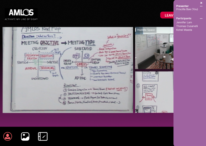
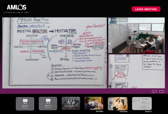
Through the second part of my internship, I learned how the small details impact the larger picture. Especially with a digital product, having multiple iterations and improvements from user testing created a fully-fleshed out and original solution that addressed several user challenges. It was extremely helpful learning from UX Design professionals and seeing their thought processes.

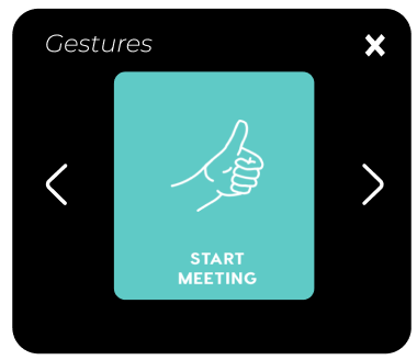
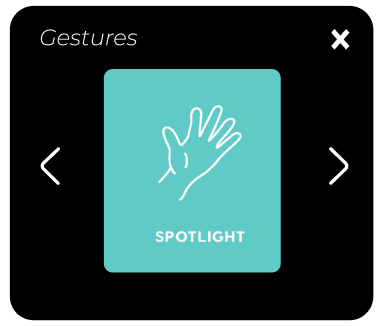
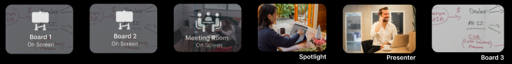
To make the product a stand-alone, we had to take in account of several different factors and coordinate cross-functionally with several teams such as software development, legal, business development, and more. The more that I interacted with my team, I understood how to think as a UX designer and how to ask the right questions such as "how might we cater towards an audience such as a creative office space?" , "In which specific ways can our designs improve the quality of hybrid work?" , or "What features are missing from current competitors that we can integrate in ours?" .

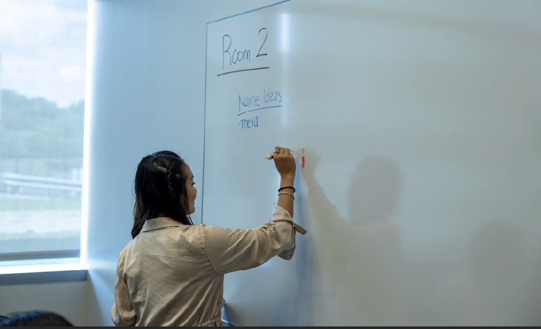
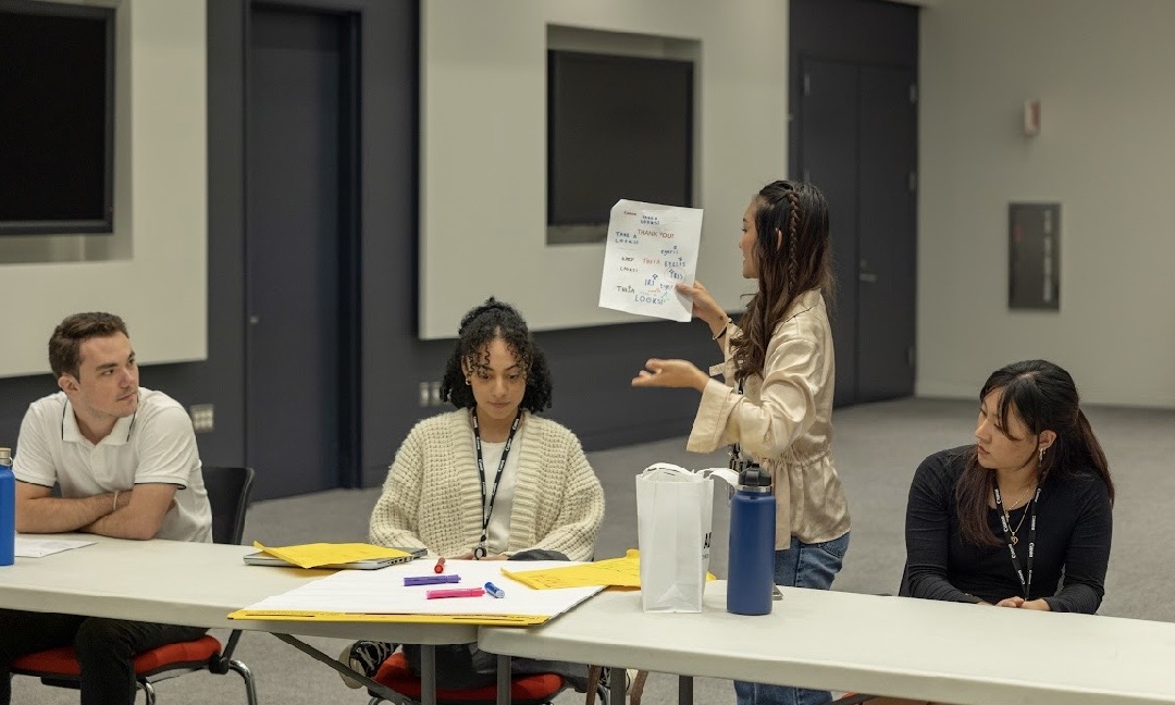
Especially as I got to lead a focus group, I learned how to manage a large amount of people and navigate through user testing sessions without any bias. It was very insightful hearing feedback from users and getting to apply this feedback to the new version of AMLOS.