SWIPE
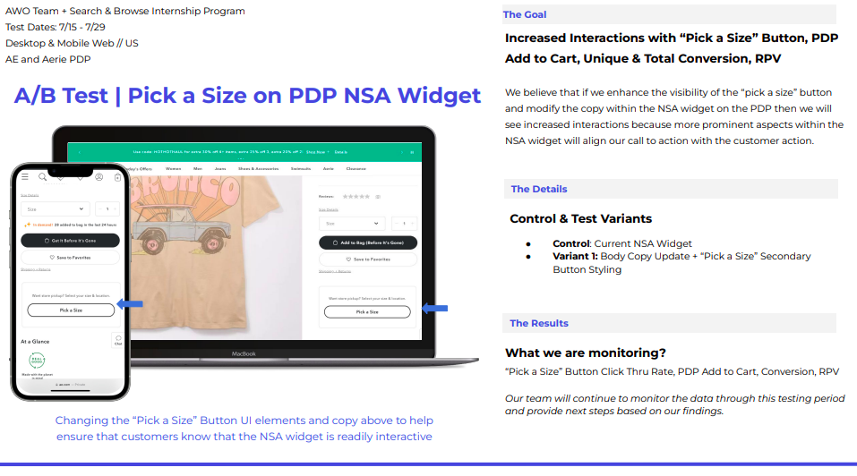
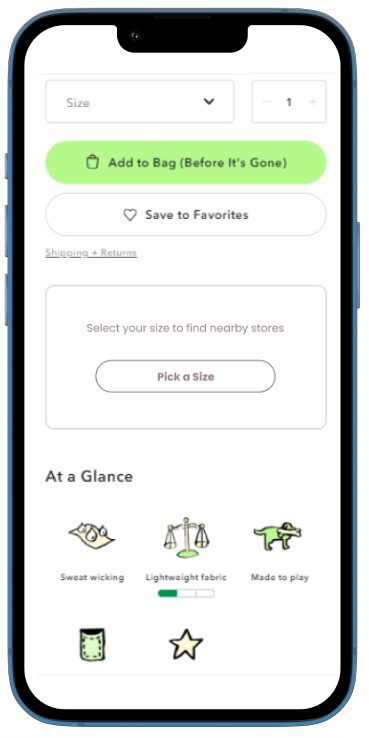
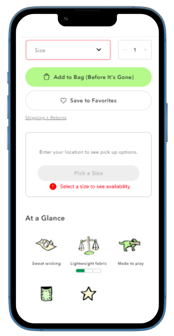
Product + UX/CX Design (Technology)
AEO Inc. • Internship
Tools ~ Figma, Jira, Agile Scrum, Tableau
AEO logo
AEO logo
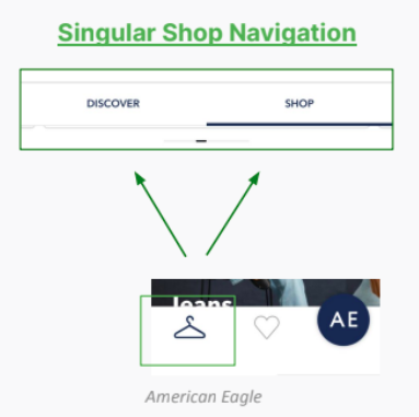
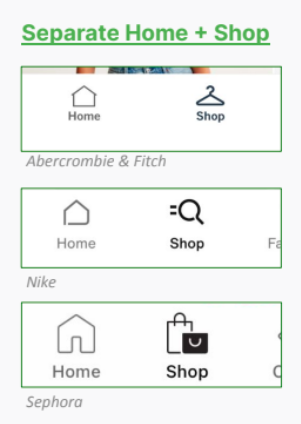
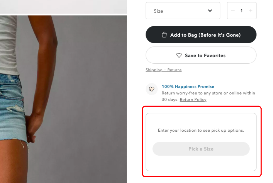
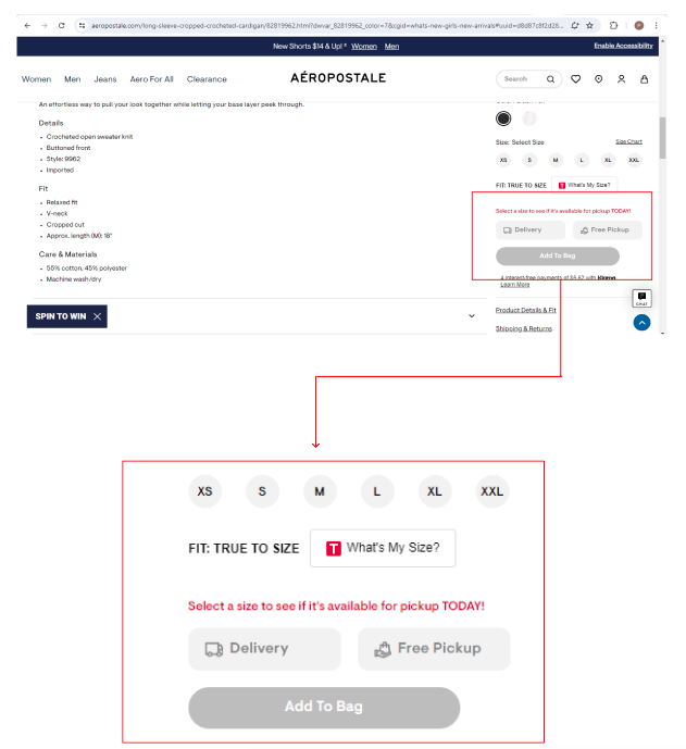
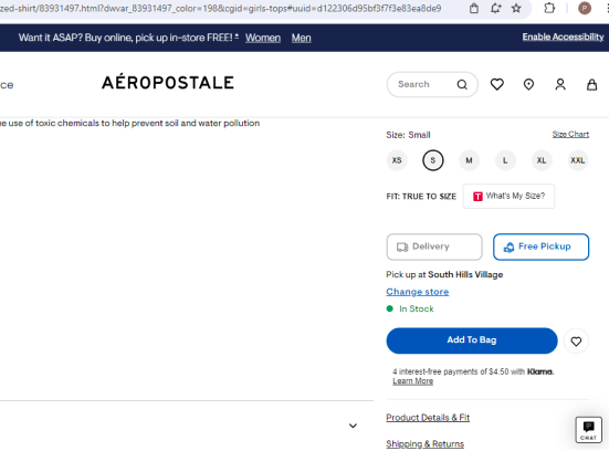
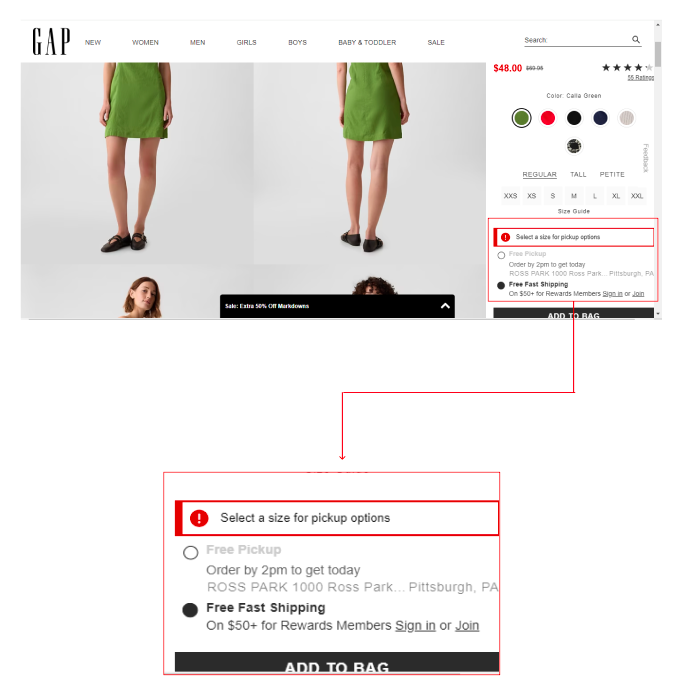
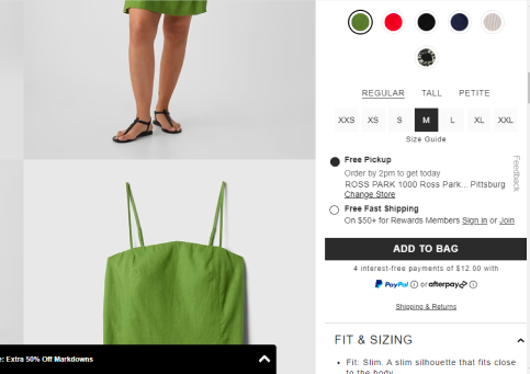
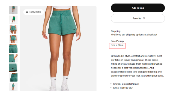
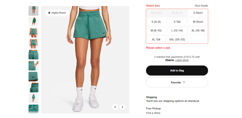
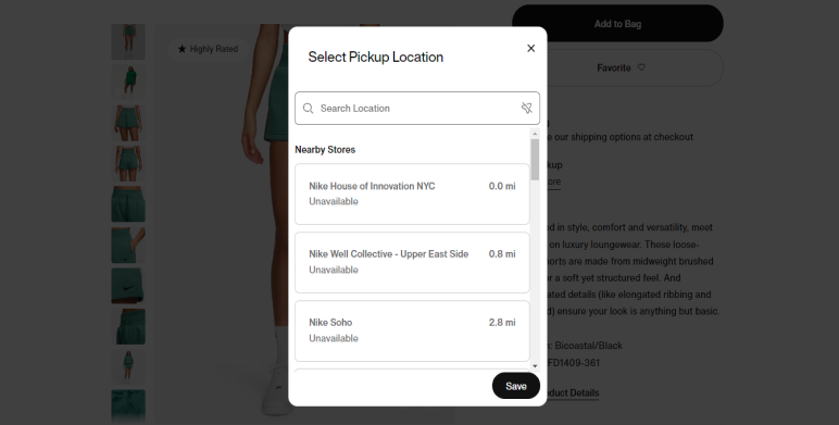
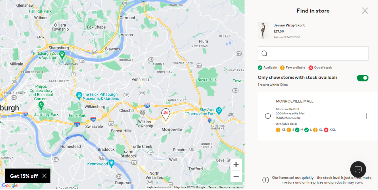
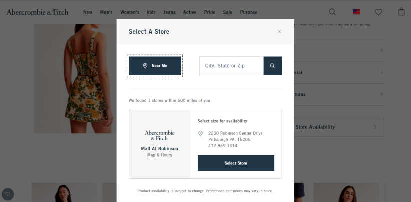
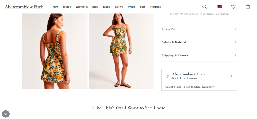
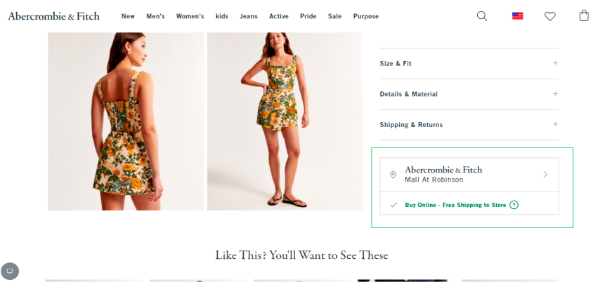
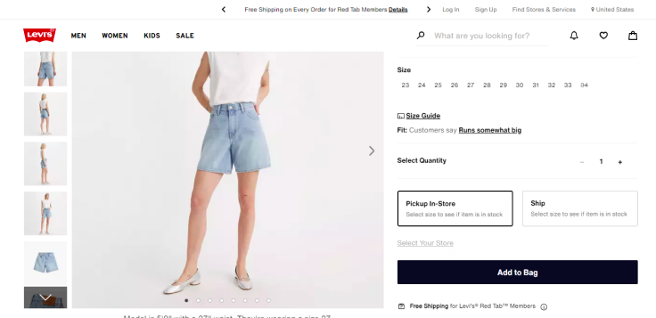
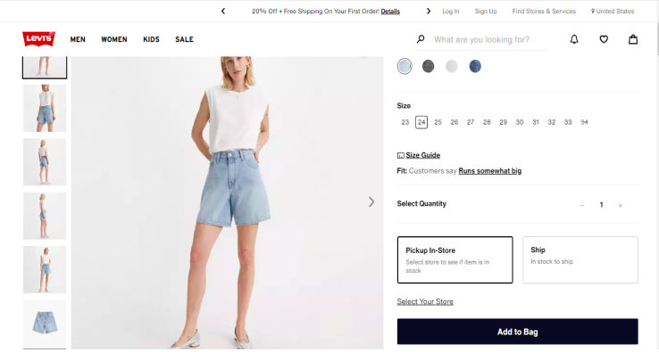
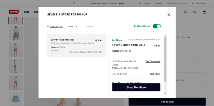
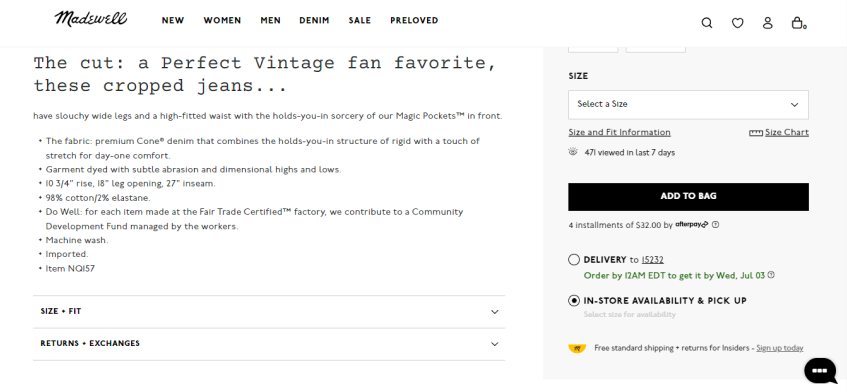
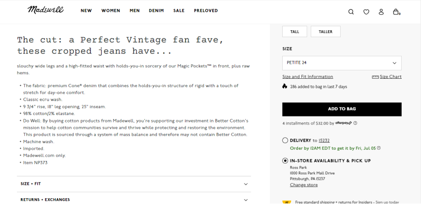
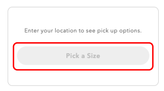
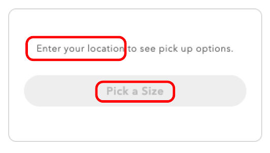
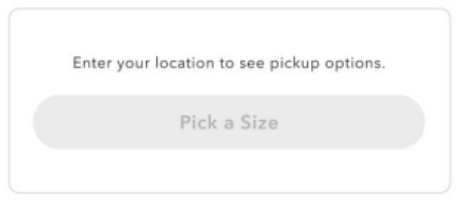
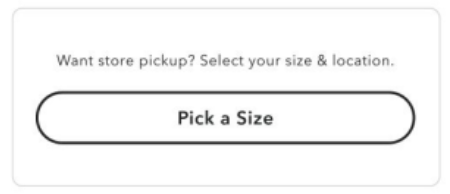
Driving cross-platform improvements for American Eagle and Aerie's BOPIS widget, focusing on seamless, intuitive design.

Problem statement
As retail technology continues to evolve, even small details on home and product pages can impact the user experience. Our team focused on improving American Eagle's BOPIS widget, which lacked clarity and alignment in its call-to-action design—leading to potential confusion and missed conversions.
Problem statement
Problem statement
Research
Competitive Research
In order to fully understand our website's motives and paint points, I initially began with a competitive shopping analysis which further analyzed where American Eagle's positioning was in the world of retail. This gave me a further understanding of the digital product and what features AEO could potentially implement in the future, giving me an insight for what I should pursue for my summer project.
Mobile App Navigation Competitive Analysis
Mobile App Issues
Their current "Lifestyle" UI of the app navigation created a few challenges for customers to find the right product:
Images not being the best match for the category
Text overlay decreasing category visibility
Navigation content heircharchy and information overload

This research allowed AEO to find trending mobile app navigation features that could be applied to their app to create a more seamless experience for users. I was able to identify and analyze certain categories where there is a high opportunity for AEO to grow and improve the user journey such as: image types, lists, subcategory filters, and Home vs. Shop navigation bars.
MHH
Competitive Analysis Key Insights

Image Types Examples
Lifestyle Images

With lifestyle images being integrated in a majority of our competitor's navigation, it initially attracts users to shop while also capturing the essence of the brand.

Main Tiers

Whenever images are in navigation, they are typically in the primary tiers, and the secondary tiers are more detailed categories by list.

Visual Separation

Within each navigation that includes images, there is clear white space, differentiating each image and category.

Lists Examples
Increased Arrows

More frequently, we are beginning to see an increased use of arrows in list navigations. This gives users the idea that they will be taken to their desired PLP or a new screen once the arrow is clicked.

Decreased Use of Dropdowns

Dropdowns tend to slow the user down as they have to click twice, scroll, and look through their options, which can be rather timely. Additionally, with lengthy lists with dropdowns, it can create an information overload for users and present them with too many choices at once.

Subcategories Examples
71%
of researched
competitors

implemented a horizontal subcategory filter with several diverse UI elements.

Effect on Category Tiers

These subcategory filters helped users reach their PLP in as few as 2 category tiers, creating more opportunities for users to see products more quickly.

Subcategory Filter Benefits

Subcategory filters essentially replaced dropdowns in lists, creating:

  • Fewer Category Tiers
  • Efficient User Access to Desired Products
  • Holistic View of Product Options

Navigation Tab Comparison

Singular Shop Navigation

VS.

Separate Home and Shop Navigation
Key Observation

Major competitors are trending towards separating Home and Shop functionalities in their navigation, providing distinct pathways for browsing and shopping. This presents an opportunity for AE + Aerie to consider restructuring their navigation approach.

BOPIS (Buy Online Pick Up In Store) Competitive Analysis
After the mobile competitive analysis,I had a better sense on what AEO's brand was and what their users were looking for. Therefore, by focusing on the user journey, I applied this mindset to a desktop competitive analysis. I narrowed down my research and project idea into one aspect on the product detail page which was the BOPIS option. In order to solidify our hypothesis and create design comps for the test, I also reviewed other competitive landscapes to analyze what other companies were implementing in their designs.
American Eagle's Current BOPIS Widget Design
MHH
Before picking up an item from a store, users must first:
  1. Select Their Size
  2. Select the BOPIS Option
  3. Enter their Location to see Availability
Before, I began the research, I focused on the first step of the BOPIS Widget: Selecting their Size. I noticed that there were certain intracacies in the design of the button because ALL users must select their size before they can even interact with the button, so I wanted to see how other companies were implementing this first step.
Here's How Other Companies Did it:

Before Size is Picked
Aero 1
After Size is Picked
Aero 1

Before Size is Picked
Aero 1
After Size is Picked
Aero 1

Before Size is Picked
Aero 1 Aero 1
After Size is Picked
Aero 1

Before Size is Picked
Aero 1
After Size is Picked
Aero 1

Before Size is Picked
Aero 1 Aero 1
After Size is Picked
Aero 1

Before Size is Picked
Aero 1
After Size is Picked
Aero 1 Aero 1

Before Size is Picked
Aero 1
After Size is Picked
Aero 1
After analyzing these companies, I had discovered these certain characteristics for some stores:
  1. Using a red alert, they will almost always require users to pick a size before allowing them to pick up in stores.
  2. Some stores have small, unnoticeable "Find in Store" texts
  3. Color indications of what is available, few available, and out of stock can be visually readable
  4. If users are prompted to choose their location first, it results in a longer BOPIS process due to the possibility that the location does not have their size
Desktop & Mobile Website BOPIS Widget Issues
AEO's "Pick a Size" button's gray and muted color makes it seem as if it is not clickable
Aero 1
"Enter your location..." copy above the button does not match the customer call to action to "Pick a Size"
Aero 1
Ideate
Ideation
Hypothesis Creation
One of the first aspects in creating an A/B test is to develop a straightforward but well-rounded hypothesis that has all the key details. After many iterations and refinements, my team and I were able to create this hypothesis to counter the current BOPIS Issues:
"We believe that if we enhance the visibility of the "pick a size" button and modify the copy within the NSA widget on the PDP then we will see increased interactions because more prominent aspects within the NSA widget will align our call to action with the customer action."
control
Control
arrow
variant 1
Variant
For our final design, we decided to enhance 2 main aspects of the widget:
1). The copy above the "Pick a Size" button
2). UI of the "Pick a Size" button
We wanted to draw more attention to this BOPIS option as the control appeared inactive although users could actually click on the option. Along with further analysis, we identified our comp designs, metrics, test variants, and overall test plan. Our main goal was to identify if we could improve the "Pick a Size" button interactions while keeping an eye on BOPIS orders/revenue, RPV, conversion, etc.
A/B Test
A/B Test
MHH
Final BOPIS Widget Test
US High Level Results | Desktop
+3.28%
>99% Confidence
-0.5%
~60% Confidence
-1.5%
~60% Confidence
US High Level Results | Mobile
+1.53%
>99% Confidence
-0.8%
~58% Confidence
-0.8%
~58% Confidence
"Pick a Size" Interactions
Add to Bag on PDP
Conversion
Increased interactions led to increased BOPIS orders but decreased overall RPV.
BOPIS Order % increase
10.1%
to
12.2%
BOPIS Revenue % increase
5.6%
to
6.9%
Insights:

An increased amount of BOPIS orders + revenue may have resulted in a loss of total RPV from a lack of delivery/shipping fees, personalization, and efficient search/checkout processes.

Monitoring Metrics (Data Outlier): Although overall RPV was down, we discovered that specifically on the date the A/B test was released, there was a trend where BOPIS Order % decreased which potentially could have contributed to the result.

After the test was released, we were able to see significant changes. One of the main changes we noticed was that the "Pick a Size" interactions increased significantly which was our main goal, and our overall BOPIS orders and revenue also increased during the test. However, overall RPV and conversion decreased. Therefore, from a business perspective, the test needed to be pivoted in order to be fully implemented in the future.
From this test, we discovered so many positive aspects and findings surrounding the BOPIS widget, and it brought attention to questions such as "Does increased BOPIS create a gap in digital revenue?" and "Why?". Therefore, with further user research and ideation, I was able to create next step recommendations. Whether it may be creating new designs or revisiting our hypothesis, my team and I found that this widget had several complexities around it, and that our final recommendations consisted around: additional user research, considering different design options, and retesting and analyzing our data.
Next Steps
User Research with BOPIS on the PDP
  • • Evaluate whether BOPIS is a preference for AE customers & what pain points to adjust
Revisit hypothesis
  • • Customers need clarity for conversion - NSA widget may be unclear
  • • Need a widget that doesn't distract users from main checkout flow
Test until we've Optimized Metrics
  • • With new solutions, we can continue to test & finalize a design that leads us to optimize interactions, RPV, BOPIS revenue, etc.
Future Designed Recommendations
control
variant 1
Reflection
Reflection
Overall, this being one of the first moments where I was able to professionally run and monitor an A/B test. I became fully integrated into the most exemplary aspects of having a supportive and collaborative team that helped me run this test. It was extremely intriguing how one of the smallest details can create such a large difference in RPV or conversion, and sometimes, results can be unexpected. However, how we navigate the next steps as a team is one of the most important lessons I learned from my time at AEO!

As an intern, I was very excited to make a difference in the grand scheme of helping a business excel through creative aspects of design and product management. My time as a product intern taught me so many key ideas about the customer experience in the retail industry and how to navigate and cater technology towards the business and customer value.