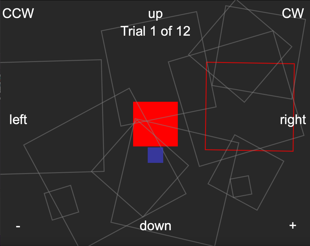
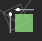
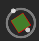
While coding Prototype 1, we had had an idea to resize and scale the box using sliders that would be beside the box (see bottom left). This never became its own prototype, but morphed into the idea that a circle would be better for rotation (see bottom right), since it's intuitive to the user; so that ended up being what we added to Prototype 3, along with the improved scaling from Prototype 2, as the scale slider wouldn't have fit along with the rotation circle.
This project was extremely valuable to me because I learned how to create meaningful designs and iterate through them with a strong team. Through each and every iteration and user testing, I learned something new about the controls and improved an aspect each time through Processing code and design choices.
In the future, if my team and I were to further the complexity of this project, we would combine the resize and rotate buttons int one and try to account for more unique and unforeseen cases such as smaller boxes or when the box was outside of the screen. I was able to understand how we could improve each iteration through creative thinking in unconventional ways and collaboration through clear, stable communication.